


License details
Commercial
2.x Compatiabilty
71250
Opencart Mobile Theme
(5 reviews)
- $29.99 $28.49
Sold by an Official OpenCart Gold Partner
Free updates for 6 months, valid for one license only
Secure checkout, instant delivery
Facing an issue?
Raise a ticket
Demo Videos
See the extension in action before you buy — the live storefront, the admin panel and the complete video walkthrough.
Live Storefront Demo
Browse a real OpenCart store running this extension.
Admin Panel Demo
Explore the extension settings from the admin panel.
TMD is an Offical Partner of OpenCart
View Profile: TMD OpenCart Extensions India
Overview of TMD OpenCart Mobile Theme
Your website will automatically switch to this mobile theme whenever a user opens your website on mobile or tablet devices. Your current theme will remain intact and always be shown on the desktop, and laptop screens. A mobile Theme is the best solution for that website which is not optimized for smaller screens.
Unlike other themes, This theme lets the admin update the Retina-ready logo, colour theme and menus to match the brand for the mobile website only. In the footer, you can write the contact information. Customers can subscribe to the newsletter.
Also, your website website become responsive on all mobile and tablets. The mobile theme also supports the multi-language feature and the latest version of OpenCart.
Changing Color Theme
You can update the color of every element of this theme just from the setting. It has a in-built javascript color picker that enables the admin to visually choose the color for every element, including buttons and text.
Businesses can update the color theme of the website to match the campaigns or occasions like Diwali, Christmas, Black friday, New Year, etc. It will enhance customer engagement and seasonal promotions.
From the image background to button colors, nearly every visual aspect of the mobile theme is customizable, allowing for a unique look and feel.
- Theme Text
- Body Bg Color
- Header Bg Color
- Footer Bg Color
- Icon Text Color
- Menu Bg Color
- Menu Text Color
- Button Bg Color
- Menu Text hover
- Primary Btn Color
- Subscribe Btn
- Add To Cart Btn
- Product Name color
- Buy Now Btn
- Product Name Hover
- Price color

Customizing the Left Drawer Menu Bar And Updating the Logo
The website has a left drawer menu which will give you a feeling of accessing the app on a mobile. Admins have the ability to customize the left drawer of the mobile interface, showcasing brand logos and icons for various products, categories, and other page links. in the menu.
Update the logo that looks good in the small screen size. Also, define the height and width of the logo. This allows for brand recognition and quick navigation.
Admin can create menus that will only display in the mobile or tablet screens. Navigate to **** Mobile theme > Menu Setting **** Press the Create new menu button. Select the icon, write the menu name, and select the parent if you want to make this menu sub-menu (child menu). enter the url of the page, and hit the save button. You can add up to 2 levels of sub-menu in this OpenCart mobile theme.
- Logo
- Logo Height/width
- Menu
- Add up to 2-level sub-menu
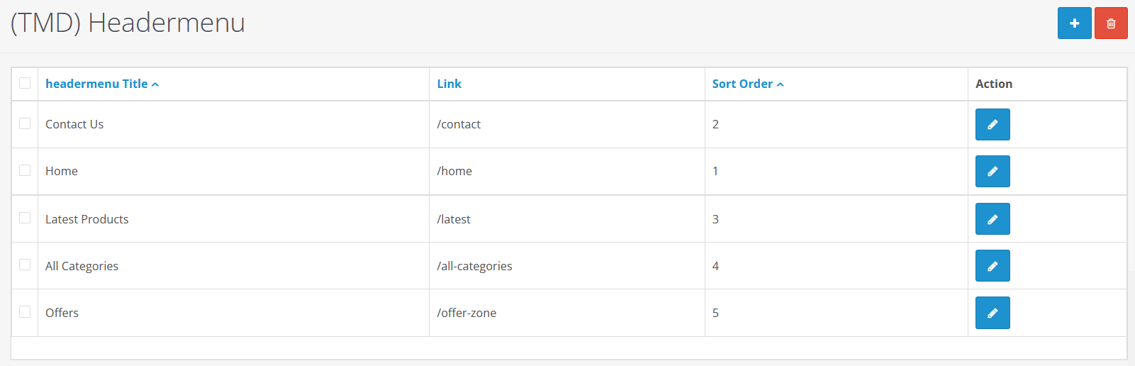
Newsletter Email List With Add and Export Feature
Let your user subscribe to the newsletter and submit their name and email ID. This feature in the OpenCart mobile theme provides a streamlined way to manage your newsletter subscriptions.
The add and remove feature lets the admin manually add the new subscriber to the list or remove the subscriber to maintain healthy email marketing campaigns. Admin can import the list into another email marketing tool.
The export function is even useful, which allows the admin to download the entire list of subscribed users in the Excel file.
Customizable Footer Titles and Contact Details
You can personalize the content of the footer by writing custom titles like "Follow Us" or "Contact Us," and can also include contact details such as landline number, mobile number, email ID, address, etc.
The footer section can display the company's physical address and offer multiple avenues for customers to connect with the business.
OpenCart Mobile Theme Working Perfectly With Multi-Language
Targeting different audiences becomes easy when your website is offering the content in their primary language. The theme is built to adapt to different languages and currencies, making it versatile and user-friendly for international customers.
This theme is fully compatible with the multi-language. User can select their preferred language from the header section of the website from any page.
Automatically Show Mobile Theme on Mobile and Tablet Devices
When a user tries to open the website, it automatically detects the user agent, browser name, size of screen, etc. If the device has a smaller screen size then this mobile theme will be displayed.
It will be done within a fraction of a second and does not impact the website loading time.
Adapt the Screen size - Responsive Layout
The UI/UX of the theme is designed to make a better user experience. Your users will able to shop the products from the website from their devices as they have done before. It uses the BootStrap CSS. Which makes it responsive on all devices.
It will adapt to screen sizes from mobiles and tablets automatically. Each device gets a viewing experience tailored to its screen size.
Compatible With Multiple OpenCart Versions
It is developed by following the standard guidelines. Therefore it is perfectly working with the latest versions 4x of OpenCart and 2x, 3x as well. You will always find the theme compatible with your OpenCart website.
You do not need to worry about its version compatibility as you will find the theme is always working with older to latest versions of OpenCart.
Support
If you are looking for help regarding this OpenCart theme or want any customization or development on your website. Please create a ticket. We will get back to you as soon as possible.
Tags:
- mobiletheme
- mobile theme
- notepad theme
- mobile
- fast mobile
- mobile framework
- mobile template
- android mobile
- iphone mobile
- samsung mobile
- galaxy mobile
- blackberry mobile
- mobile commerce
- mobile shopping solution
- mobile view
- mobile optimized
- mobile smartphone optimized
- free mobile
- mobile demo
- mobile site
- mobile store
- mobile shop
- website mobile
- mobile webstore
- mobile web
- mobile website
- go mobile
- ready to use mobile tempalte
- mobile architecture
- mobile support
- mobile dedicated version
- separate mobile
- mobile footer
- mobile header
- only mobile theme
- tmd mobile theme
- customize theme
- coloroptions theme
- customize mobile theme
Click Here to see Documentation
Full Documentation
Support
For any suggestion or have a pre-sale question. Please create a ticket. We will back to you as soon as possible.
Compatiabilty
| Supported OC Versions | 2.1.0.2 , 2.1.0.1 , 2.0.3.1 , 2.0.2.0 , 2.0.1.1 , 2.0.1.0 2.2.0.0 2.3.0.2 , 2.3.0.1 , 2.3.0.0 1.5.3 , 1.5.3.1 3.0.3.8 , 3.0.3.7 , 3.0.3.6 3.0.3.2 , 3.0.3.1 , 3.0.3.0 , 3.0.2.0 , 3.0.1.2 , 3.0.1.1 , 3.0.0.0 4.0.0.0 4.0.1.1 , 4.0.1.0 , 4.0.2.0 , 4.0.2.1 , 4.0.2.2 , 4.0.2.3 |
| VQMOD Required | No |
| MultiStore Support | No |
| Support | yes |
| Update | yes |
Related Products
Bestseller

Modules
Add and remove captcha each form (2.x.x & 3.x.x, 4.x)
.tab-description-n..
(11)
2.x
$20.00
$19.00



OpenCart Themes
Trendz Fashion MultiStore & Responsive Theme
.tab-description-new..
(3)
2.x
$39.99
$37.99



OpenCart Themes 2.x
Platinum Jewellery - Responsive Opencart Theme
.tab-description-new..
(1)
2.3.x, 3.x.x
$29.99
$28.49